Colour Themes
Brand colours are important and form a crucial part of a brand’s aesthetic, creating a strong association and lasting loyalty amongst customers.
Many resources are spent developing the perfect colour palette for a brand to match its personality, messaging and overall mood. Colour is championed at Marber from blushing pinks to vivid purple, classic black and sophisticated coffee. Colour should flow seamlessly into packaging and gifting efforts and is something that is prioritised and focused on in Marber’s work.
-
The Pastel Edit
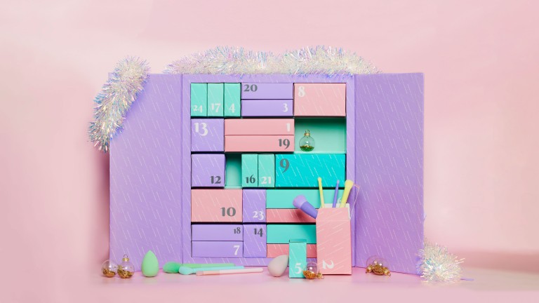 Blushing pinks, powdery blues, whimsical lilacs and delicate yellows. These soft and romantic colour palettes are elegant and soothing evoking feelings of positivity.
-
The Bright Edit
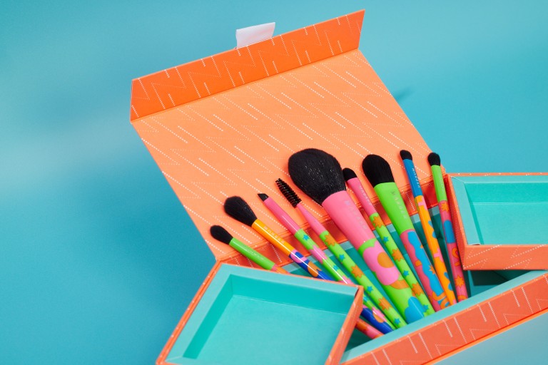 Neon pinks, intense blues, vivid purple and firecracker orange. These rich and vibrant colour palettes are energetic and optimistic evoking feelings of happiness and excitement.
-
The Neutral Edit
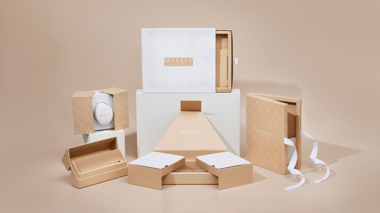 Nude pinks, calming beige, trendy coffee and natural greens. These versatile and yet sophisticated colour palettes are relaxing and balanced evoking feelings of tranquillity and security.
-
The Monochrome Edit
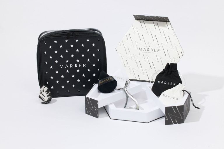 Serious black, pure white and luxurious metallics. These timeless and classic colour palettes are clean and strong evoking feelings of opulence, mystery and cleanliness.